
St.George Brand Refresh
Phase 1: Brand Audit
Understanding Where We Started
St.George, an established player in Australian banking, had a brand that leaned heavily on a playful, somewhat childish identity. While the intention was to be friendly and accessible, the result often lacked the visual authority and trust that customers expect from a financial institution.
Through a comprehensive audit of:
Visual identity (logo, colors, typography),
Customer perception surveys,
Digital presence (mobile app, website),
and retail experiences (branches, cards, signage),
Phase 2: Research & Strategy
Balancing Warmth with Professionalism
Our strategy hinged on one key insight:
People want a bank that feels human and friendly, but still competent and secure.
We looked into:
Market competitors (e.g., ANZ, NAB, Commbank),
and international banking trends
What emerged was a clear positioning opportunity:
Keep the approachable spirit, but translate it through a lens of modern design and mature trustworthiness.


Phase 3: Brand Evolution
Approachable. Elevated. Unmistakably St.George.
Dragon Reimagined
The dragon icon — a core asset — was refined into a more sculptural and elegant form. Its silhouette remains friendly, but now communicates resilience, leadership, and focus.
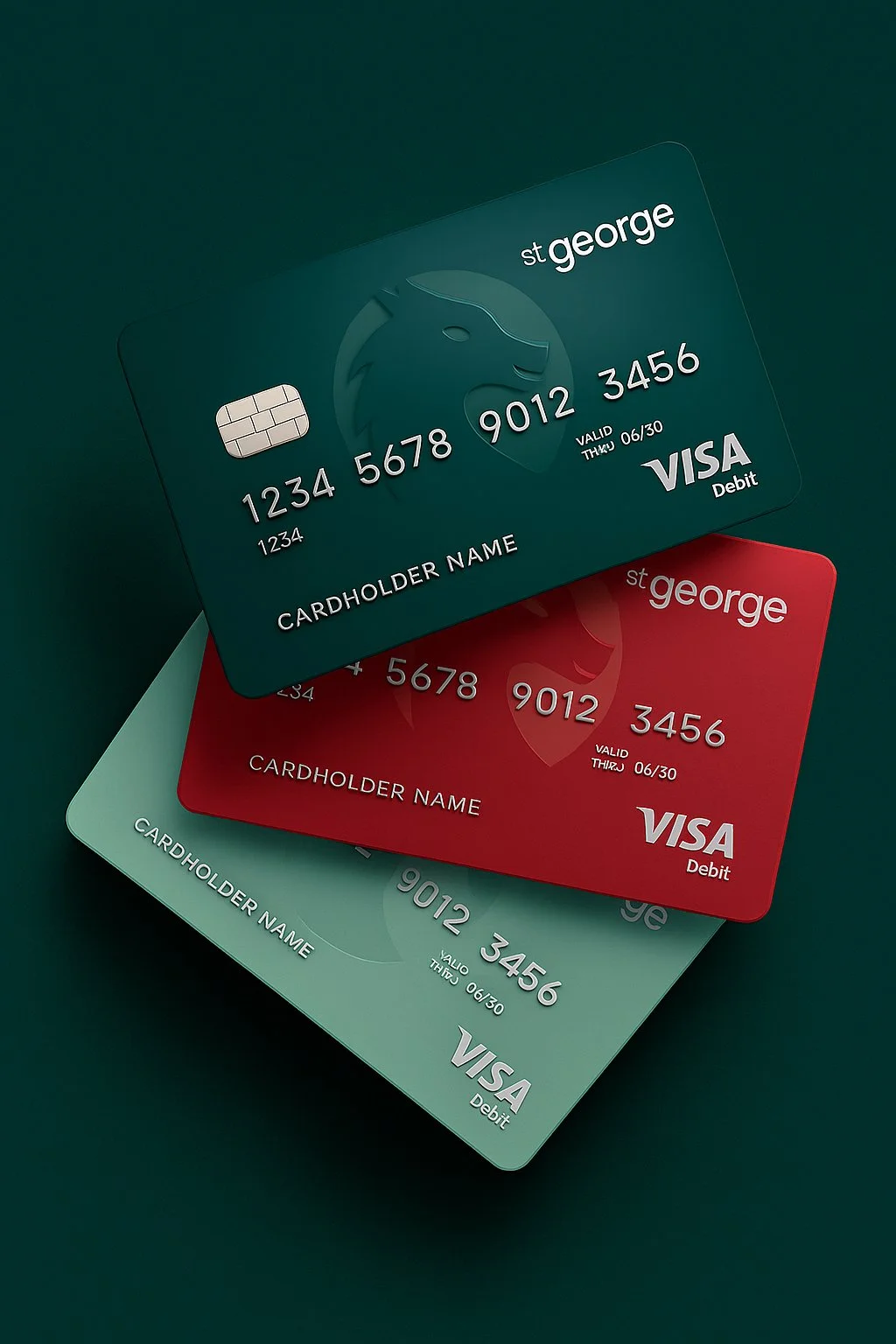
Color Palette: Evolved, Not Replaced
We kept St.George’s signature greens and reds, but updated them with deeper, more refined tones that feel premium and digital-friendly, creating stronger contrast and flexibility across mediums.
Typography & Layout
We retained the lowercase logo styling — a nod to accessibility — but paired it with more confident, minimalist typography systems across collateral and screens.
Phase 4: Execution
Consistency Across Every Brand Touchpoint
This wasn’t just a logo update. We executed a full multi-platform rollout that touched every corner of the brand.
✦ Offline Applications:
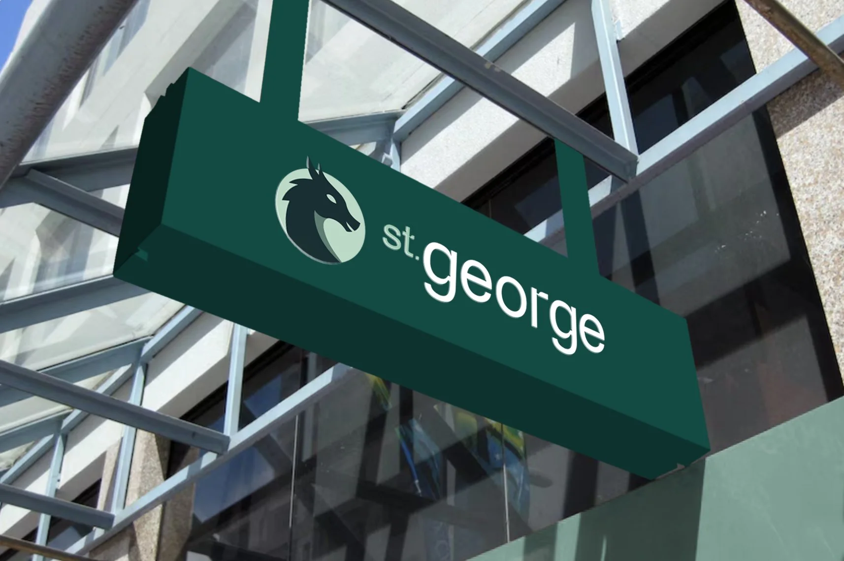
Signage: 3D-lit signage with natural shadow effects for depth and realism
Debit & Credit Cards: Modern, embossed, color-rich cards with metallic accents
Stationery & Name Tags: Simplified, elegant designs suitable for professional environments
✦ Digital Applications:
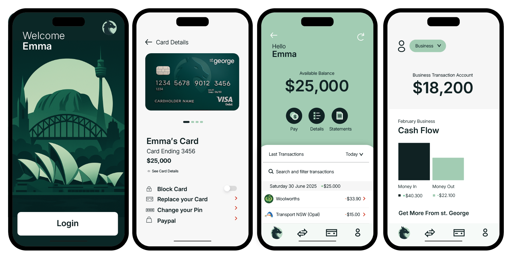
Mobile App Redesign: Clean UI with intuitive flows, improved readability, and a refreshed interface
Website Overhaul: Elevated digital brand feel with modern visual hierarchy and accessible navigation
DMs & Email Templates: Clear brand voice, consistent visuals, and conversion-driven layouts

Results & Takeaways
Brand recognition increased in testing with stronger trust scores
Customers described the new identity as “reliable,” “sleek,” and “friendly but serious”
Internal teams reported increased pride in presenting the updated visual identity
Expertise in Action
This project demonstrates the power of strategic restraint — by refining instead of reinventing, we honored St.George’s legacy while making it future-ready.
We didn’t change the story. We changed how it’s told.
With confidence, clarity, and credibility.